Without knowing it, almost everyone has encountered kinetic typography. It is a simple and foundational animation technique that can be used in creative and eye-catching ways.
Kinetic typography was first used by George Méliès, a French illusionist and filmmaker, back in 1899 by putting together multiple exposures and time-lapse photography to achieve the look and feel. Following this, it gained more popularity after the release of Alfred Hitchcock’s, North by Northwest that began with an iconic title sequence.
Since its foundation as a supporting element in feature films, kinetic typography has become an ideal tool for professional communications, particularly for animated branded content. Here’s a look at why this is the case, the benefits of kinetic typography, and how it can be used in the best possible way.
What is kinetic typography?
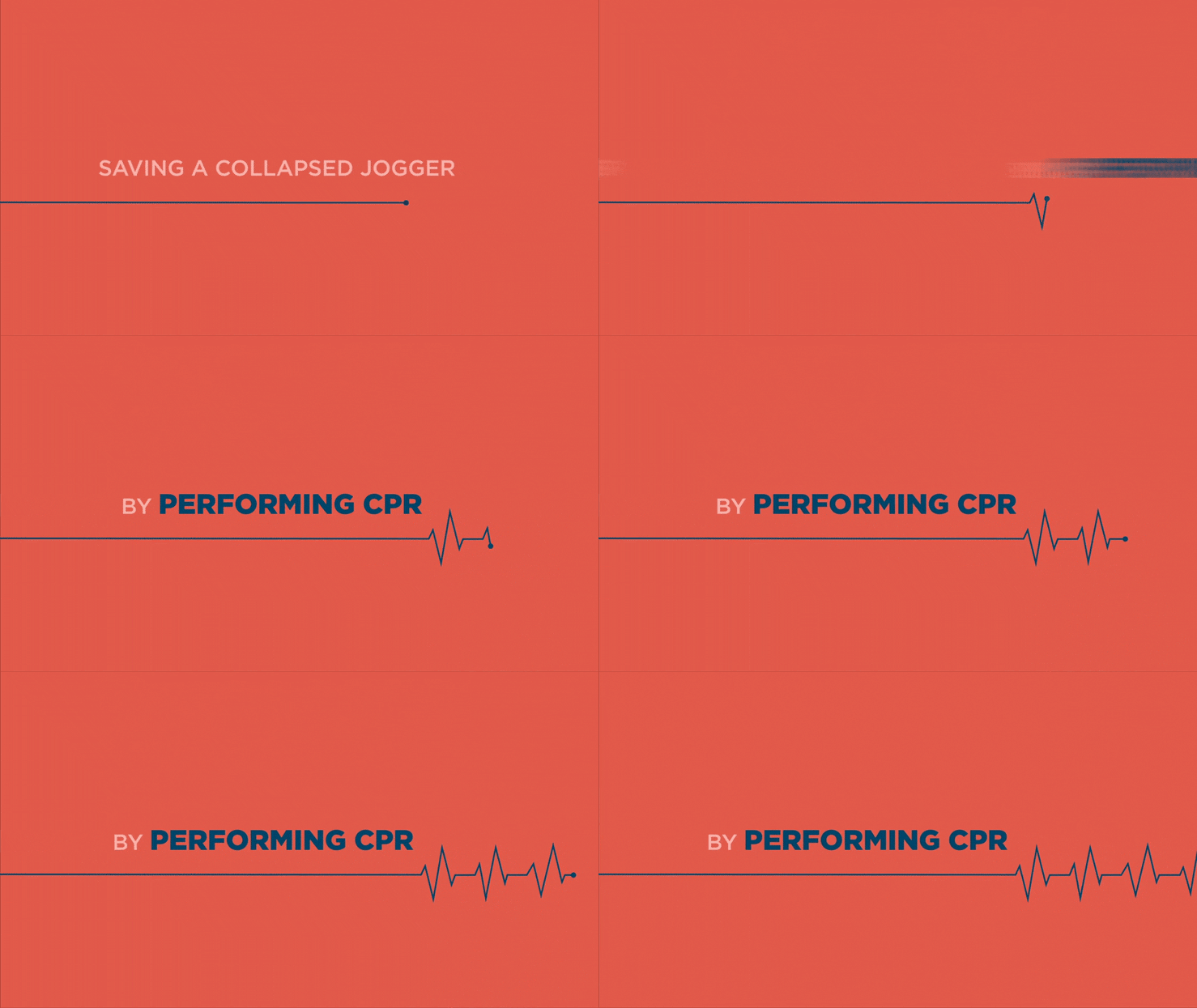
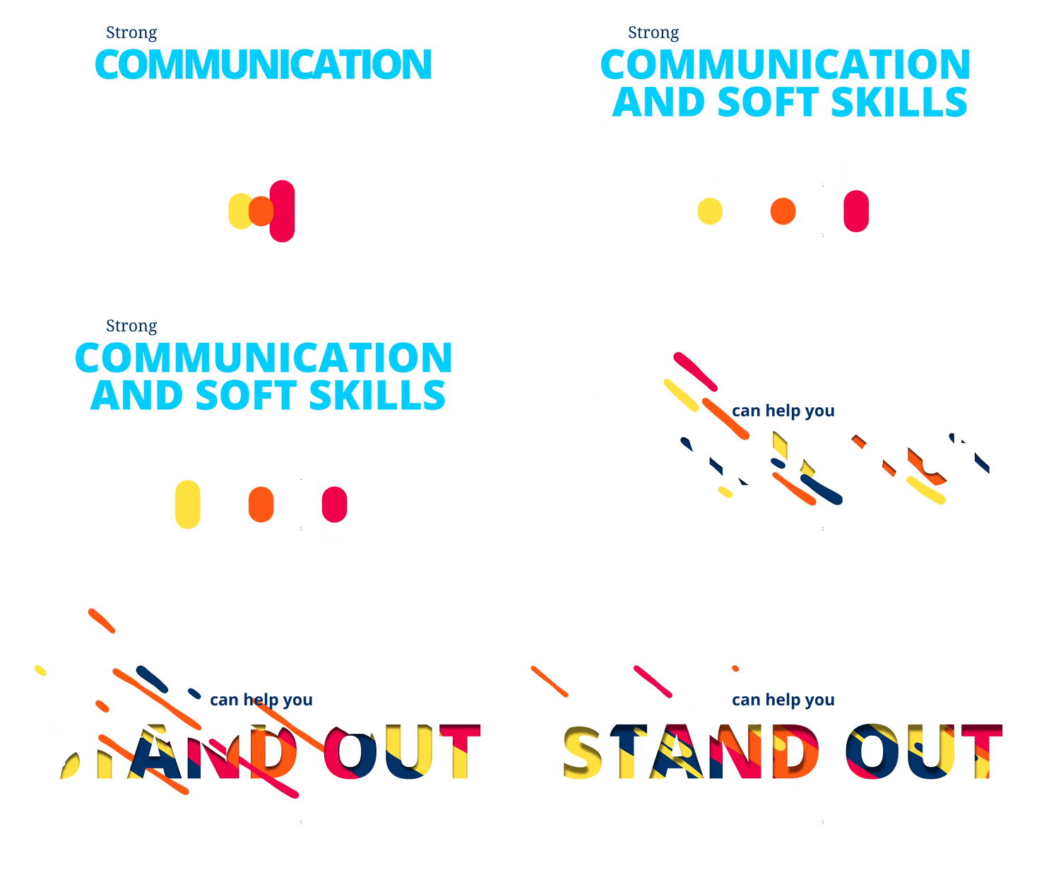
Put simply, kinetic typography is a broad catch-all phrase to describe any text that moves on the screen. The term often encompasses two distinct types of typography; motion typography and fluid typography.
Motion typography
Motion typography can be dynamic or scrolling. Scrolling motion typography can be defined as any text that moves along a plane, including sideways, upwards, downwards, advancing or receding. It is useful for animated videos that require a lot of text or large words, as it can be slowed enough and simplified to capture the attention of the viewer.

Dynamic motion typography is when the elements that make up the film’s text move in relation to one another. Letters and words may move away from one another on a 2D plane or in a 3D space. It’s perfect for videos with less text and more dramatic effect.

Fluid typography
Fluid typography is any moving text that is not bound by size or direction. Instead, it is changing shape or evolving in different ways. This allows you to have creative freedom with your moving text and brings a sense of individuality to your communications.

The benefits of kinetic typography
This eye-catching animation technique can help bring attention to some of the most important aspects of your animated film. This is particularly useful when you need to highlight statistics or research findings that need to be remembered long after the video has ended.
What is more, around 65% of people are visual learners, which means that they understand information better when it is presented visually, such as with maps, images or videos.
Therefore, out of the pool of people that will be watching your film, more than half of them will better remember what they watched thanks to the kinetic typography animations.
It also allows you to incorporate more of your brand identity into your communications. Through moving animation, you can approach your brand in a playful way that helps you stand out.
Take motion brand identity as an example. Having an animated logo instead of a static logo is one of the most effective ways to stand out next to your competitors and present a professional appearance.
The uses
When it comes to how you can use kinetic typography, the possibilities are endless. The very nature of this technique means that it can be incorporated into almost any animated or live-action video.
However, some of the most effective uses within branded content or animated video include:
– Social media animations
– How-to or explainer videos
– Internal communication videos
– Learning and development videos
– Annual reports or executive summary videos
– Motion brand identities
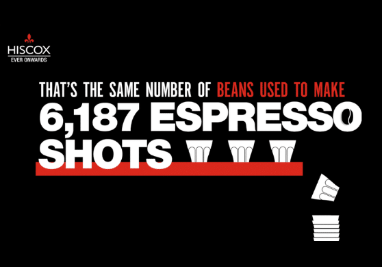
To demonstrate this further, let’s take an example of a project we did for the well-known specialist insurer, Hiscox.
Hiscox – Animated social posts
Our challenge was to create a series of social media animations for one of the most iconic and impactful print identities around.
This project aimed to highlight Hiscox’s message that there is no such thing as an average business and as such, each customer deserved to be treated differently.
The campaign focused on a series of ‘average’ individuals whose ‘average’ lives were presented using stock photography, bespoke illustrations and of course, playful kinetic typography.

Each was tailored to work in different formats and with copy and creative changes reflecting the variety of social channels, including LinkedIn, Facebook and Twitter, on which they were posted.
These animations added life and movement to this iconic brand and went on to win a 2020 Gold MUSE Creative Award.
Learn how kinetic typography can boost your communications
Working with a creative content agency will ensure not only do you get a piece of content that fits your brand, but you will find that it also delivers the desired results.
If you are interested in learning more about how we can help you achieve this using kinetic typography and animated video, we invite you to visit our services page or request a free consultation with a member of our team below.