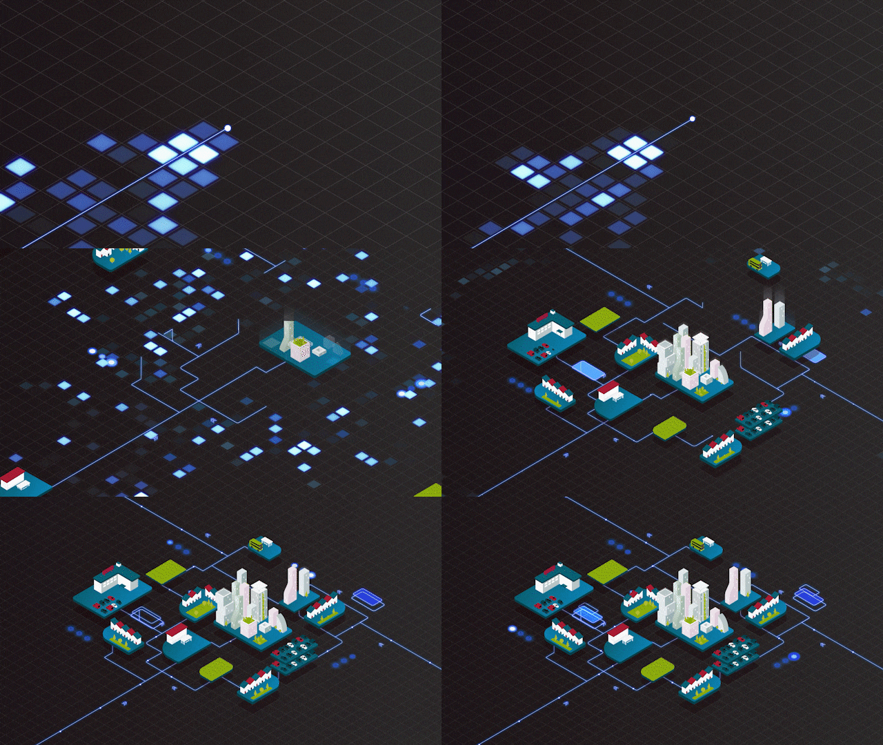
Animation has suddenly become a bit of buzzword on LinkedIn. From ad agencies to small production companies, various creative businesses are suggesting clients consider animated video for projects they might previously have filmed.
Unless you’ve been living under a rock, the reason for this is obvious; animators, and even animation studios, can operate just as well in this era of social distancing as they could before. Whereas for shoot producers and directors, there are innate limitations to their craft right now; for animation studios, like ours, this creates an opportunity to remind or inform people, as to why animation can be an effective marketing tool.
Animation is a term that conjures up many reactions.
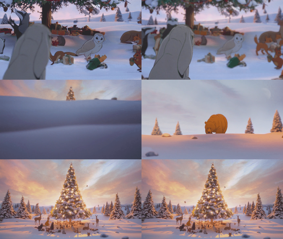
Some might remember motion graphic examples like the Oreo’s Wonderfilled campaign or powerful kinetic typography like Apple’s Don’t Blink advert; but more commonly they refer to character animation such as the 2013 John Lewis’s Bear and the Hare commercial.
Consequently, clients can be nervous at the prospect of commissioning an animated video campaign. Understanding the different styles available and how they can be employed for different brands and their various audiences is an essential part of convincing clients to spend money on animation.

While animated content is made with variety of tools and techniques, there a three core types of animation that are employed across 2D, 3D, stop-frame and so on.
Character Animation
Of these three broad animation genres, character animation is the most recognised. Many of us watched cartoons as children, then as parents, and our preconceptions are drawn from that. Often that translates into perceiving character animation as childish or silly. It would be easy to dismiss this as wrong, but campaigns such as Melbourne Metro’s Dumb Ways to Die and Hyundai’s No Limits ad prove that having fun can work to significant effect.
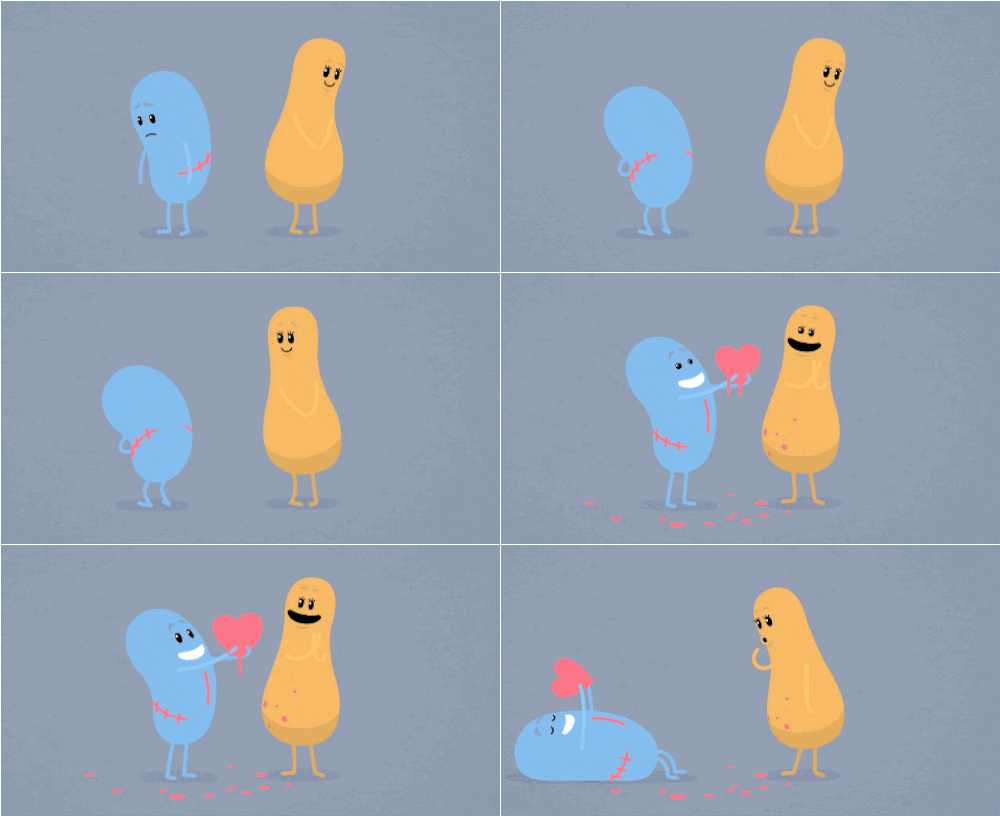
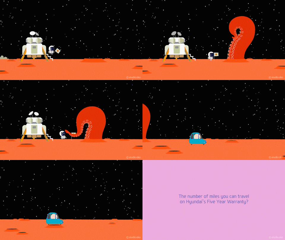
We’ve found that a playful character animation approach works well when the brief may demand a serious or somewhat dry message; for example, internal communications like this simple set of characters we created for an onboarding programme at PHD .Or charity campaigns like this spot for The Big Issue Foundation.
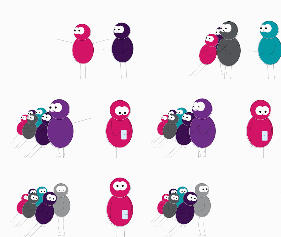

Characters animation doesn’t have to be humorous, though.
Earlier, we mentioned the famous Bear and the Hare commercial, which is a fantastic example of an emotive, animated story. Animated characters can be an excellent way of taking viewers on a journey that would otherwise be impossible; either because of budgetary restraints or owing to physical limitations. For Wyelands Bank, we created a whole town that was connected by their interactions with the lender.
While for Happy Socks, we journeyed through a whole year, from Christmas to Christmas to tell the story of a lost sock.
These examples worked well for those brands and their brief, in other cases, alternative types of animation are more appropriate.

Kinetic Typography
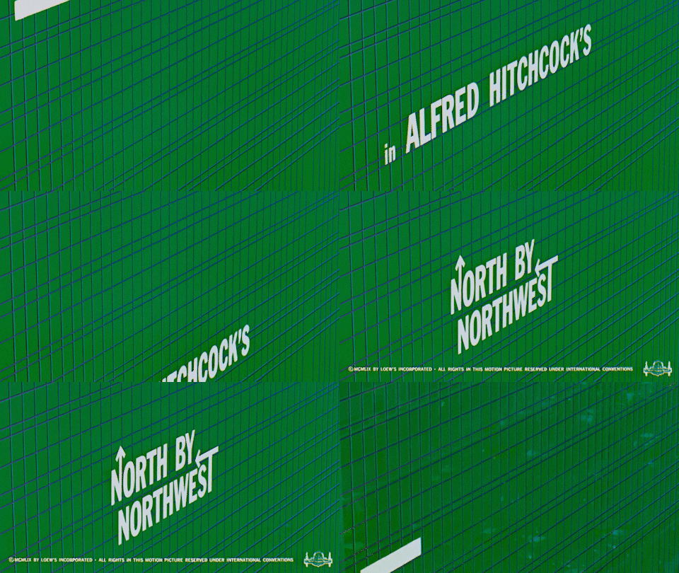
Without necessarily knowing the term, almost everyone has encountered kinetic typography in title sequences or tv adverts. First used by George Melies in 1899, type animation really found its feet after the release of North by Northwest that began with Saul Bass’s iconic title sequence.
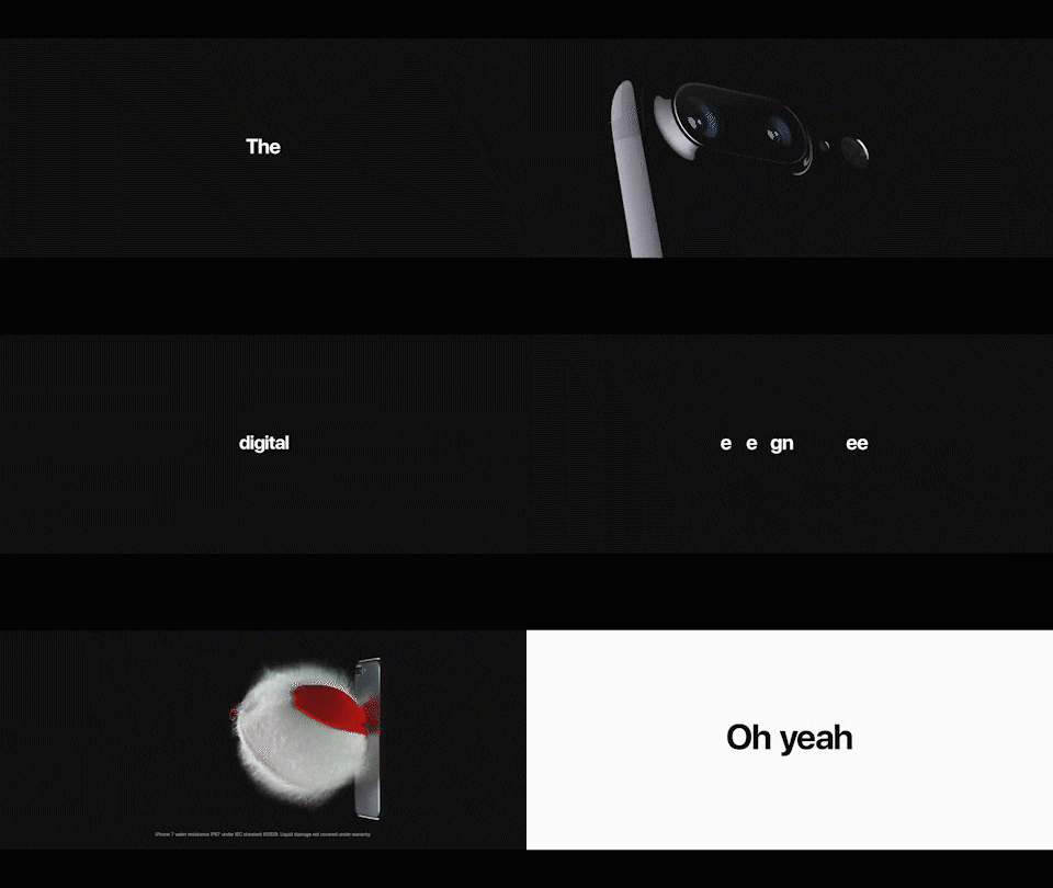
Kinetic typography is a broad catch-all phrase to describe any text that moves on the screen, we covered some of the technical stuff, including sub-genres, in an earlier blog.
Apple’s influential Don’t Blink spot is a powerful example of a dynamic layout.
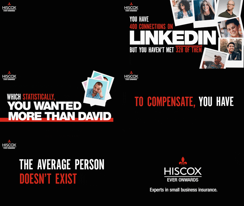
This is a subgenre of kinetic typography that sees letters or words move around the screen in 2D and 3D space. Often, this technique is featured in fast-paced, dynamic animation such as this one social media video for Hiscox.
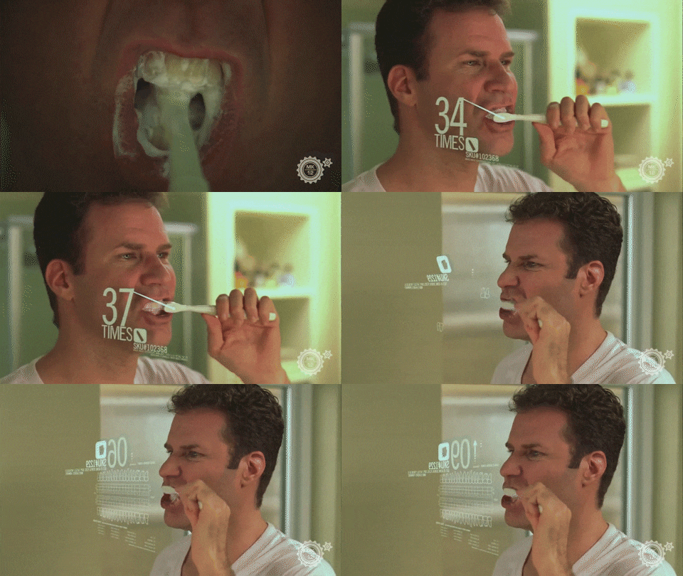
Dynamic layout can be equally effective when used with footage, such as the opening scene by MK12 from the Will Ferrell movie, Stranger Than Fiction. It’s an old one but a good one.

Alternatively, simple kinetic typography has the power to create strong emotions. This example was designed to evoke loneliness and isolation for an awards entry film.
Fluid typography
Fluid typography differs in that the words, or letterforms, actually change shape as well as move.
One of the most imitated examples of this technique is the title sequence to Catch Me If You Can, which sees the extenders of letter grow to form transitions and scenery for characters.

Fluid typography is often used sparsely, in a logo resolve or headline animation. In fact, our own Content Creatures logo mnemonic is an example of fluid typography.

Motion graphics
Motion graphic animation, or mograph as it is sometimes called, is the final type of animation. Googling ‘what is motion graphics?’ will give you a wide range of definitions; in essence, it is graphic design brought to life.
A recent example is Sainsbury’s customer campaign released to inform shoppers of new in-store practices during the Covid-19 lockdown,
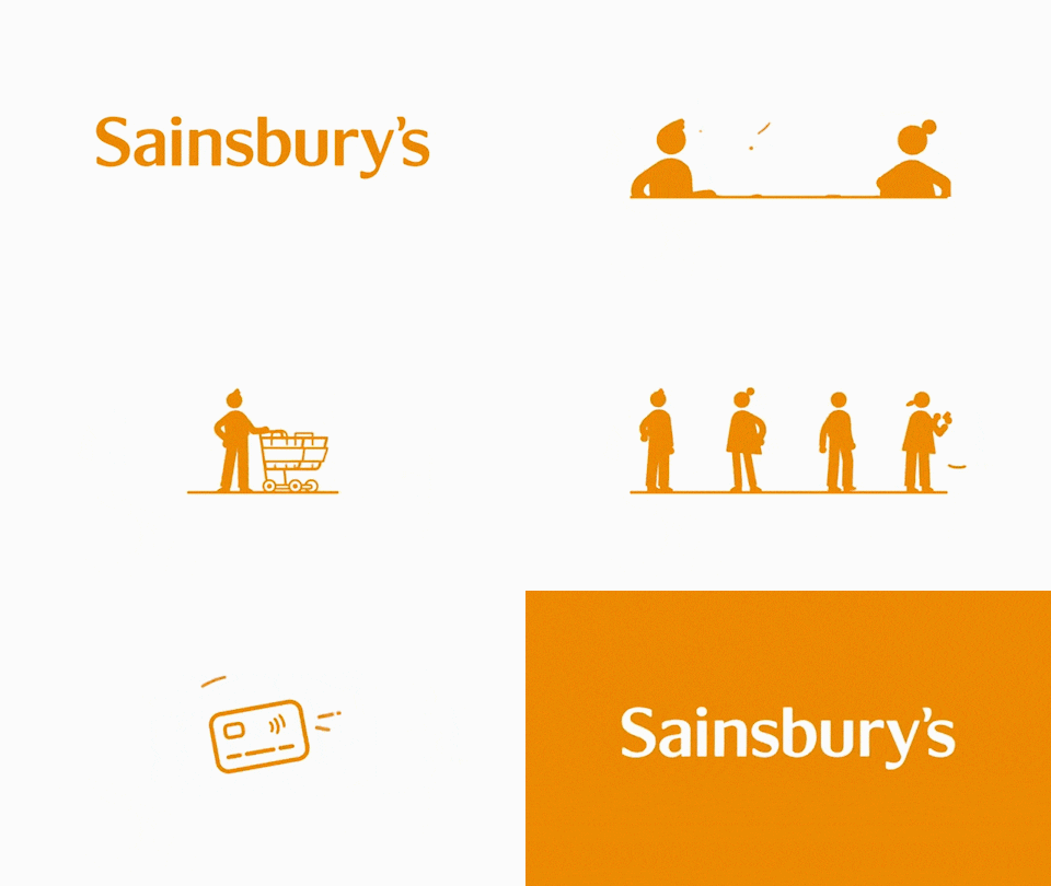
Given that graphic design is a broad church, you can imagine the variety of motion graphic animation that exists. It’s a near endless list, from illustrations brought to life to abstract shape animation, through to multimedia combinations of imagery, iconography and type.
There are many great examples of motion graphics in action; such as Noma Bar’s advert for Smart Water or Oddfellow’s spot for Nike Battle Force.
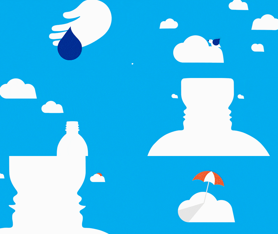

Motion graphics work well on a variety of briefs, from making the complex simple like this short animated explainer for Grundon which playfully presents the process employed at their energy from waste plants.
Whereas this used simple illustrations to tell the story, an alternative route is to opt for something more abstract like this product promo which the client needed before the product was available. It had the added advantage of being easy to reversion in multiple languages.
It may seem like oversimplifying to suggest there are only three types of animation. While it’s true that animation takes many forms, such as stop-frame, cel, 2D cut-out, hyper-real 3D and so on; nearly all animated videos can be categorised as either character animation, kinetic typography, motion graphics, or a combination of two or more.
Choosing the right creative route is all about matching form to function, the best-animated execution to a client’s brief. There will be times when they know quite clearly what they want, referring to an ad or music video or movie they’ve seen. But more often than not, it’s part of the creative process to work with the client to find the right type of animation for their campaign.
At Content Creatures, we always follow a simple five step process to help our client’s journey to the best-animated video for their brief; whether that’s creating a motion identity, a social media campaign, an internal comms video, an executive summary for a report, or a product or services explainer.
You can find out more about our process here or, alternatively contact us directly to discuss your animation needs.